People and Extensions

Thoughts on People and Technologies that Extend Them

Thursday, March 31, 2011

GNOME 3.0 Hackfest Day 5

I'm reviving this blog to thank people for their awesomeness.

This year's GNOME.Asia is special, because of GNOME 3.0's release (which is postponed #April1) and the 5-day hackest. Today is the last day of the GNOME 3.0 Hackfest and the 3nd at Dayananda Sagar Institutions. The first two days were at Intel's office. Thank you for accommodating us, Intel and DSI!

I'd like to thank the GNOME hackers for joining us in Bangalore for this event. That's Allan Day, Andre Klapper, Andreas Nilsson, Chandni Verma, Frederic Peters, Josselin Mouette, Ryan Lortie, Vincent Untz, and Committee peeps. Having a good time with you guys!

We did student training yesterday and today at DSI, for 3rd and 4th year college students from different universities. People were very inquisitive. I like how it went, so thanks to everyone who made this possible. I enjoyed spreading the word about UX and GNOME.

Kudos to the GNOME.Asia Team! It was just like yesterday when we were discussing this in Taipei. The output is great so far.

I'm probably forgetting some names right now, but this one, I shouldn't forget. Thanks to the GNOME Foundation for shipping me from Philippines to India.

See you tomorrow at the first of two days of the Summit!


Monday, November 22, 2010

Wednesday, July 14, 2010

0918 948 2520 <- My new number

I finally changed my mobile number. Please save it (+63 918 948 2520) and delete the old one.

Thanks! :)

Tuesday, May 4, 2010

Twitter and Opera Mini 5: The Future of Android Apps

Android is great, but like any other platform, there's room for improvement. As I wrote before, Android has conventions that are bad for UX. I was actually afraid that these conventions could not be broken, because those hardware buttons are here to stay and forcing changes could bring injustice to Android hardware buttons.

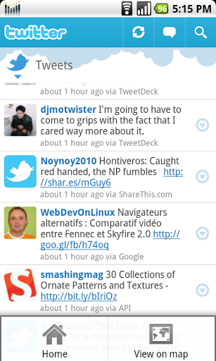
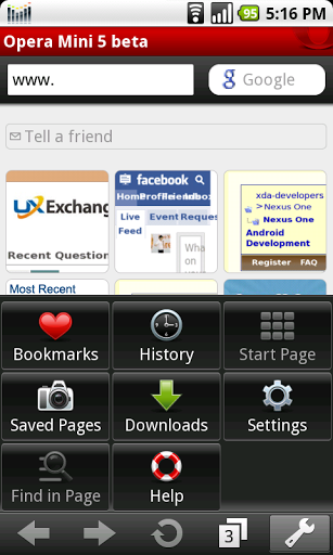
Twitter and Opera Mini 5 are two new Android apps that stand out because of their great UX design. I don't know if I should consider this fortunate or otherwise, but they're good because of not following Android conventions.

Twitter's deviations from Android app conventions include the title bar (thicker and has clickable elements), putting buttons on the screen that are usually found in the menu, and having different look and feel of tabs.

Opera Mini 5's share of deviations include the lack of menu, using the menu button to show/hide the Address Field / Search, and the inclusion of a mouse pointer among many others.

I consider all of the said deviations positive. Contrary to what I believed, the hardware buttons are still useful. They are also great especially because of showing more of the necessary GUI elements on the screen. It's time to graduate from hiding too many buttons in the menu. As I said, things that we see influence what we do. As long as clutter is avoided, it is good to show the user more of what's happening with an app and what he can do with it. After all, Google is open enough to allow deviations.

Twitter and Opera Mini 5 hold the key to the future of Android apps.

Friday, April 2, 2010

Is the iPad a Wasteful Innovation?


When the iPad was announced, people made fun of it. In a world full of laptops, netbooks, and smartphones; what unmet need would the iPad address? It runs a version of iPhone OS, which is not significantly superior to the smartphone. Is its hardware significant enough to justify the existence of iPod Touch Jumbo?

"Technology first, invention second, needs last"

Don Norman described in an essay that design or marketing research did not play significant roles in shaping powerful inventions. He said that it has always been "technology first, invention second, needs last." Inventions are not always needed, but when they succeed, they affect our lives greatly. If you think about it, life used to be fine without cellphones.

Great UX design over features

Tim Gideon from PC Mag said:
There may be things it doesn't do, but what it does do, it does remarkably well.
This new type of mobile device isn't a smartphone or a laptop. Those two do things that the iPad doesn't. However, the iPad seems to do some things better than others. The tangible feel of the web on iPad is better than the browsing experience on laptop and desktop computers. The larger screen of the iPad doesn't require mobile versions of websites, unlike smartphones or other smaller devices.

How about tablet PCs that largely share the same form factor? Apparently, even if those computers do more than the iPad, the great unique experience that the big iPod Touch provides is more significant than its lack of features.

The slate is already influential

At this early stage, the iPad is already very important that the web and other things are being shaped to adapt to its existence. Many are moving to HTML5 and new mobile applications are being made just for the iPad. As Don Norman said; most inventions fail, but the ones that succeed change our lives.

Hiding features is better than removing features

When a person can carry an iPad, he can manage to bring a laptop or a netbook instead. iPad owners could end up carrying a laptop, an iPad, and a smartphone most of the time. This means many overlapping features. Now that it appears that Swiss knives aren't always better than specialists, humanity should find a way to conserve resources. Having to maintain many devices is very wasteful. A laptop replacement, which also has the great things about the iPad, would be best. There may be some people who can afford to purchase and bring many devices with them, but waste is not justified. Perhaps, avoiding this waste is a greater need than the small pretty things about the iPad. This piece of technology should get nothing more than the attention that it deserves.

formspring.me

Ask me (just about) anything =) http://formspring.me/AllanCaeg

Tuesday, March 30, 2010

Physical Ergonomics of GUIs on Touchscreen Devices

Touchscreen devices are becoming more popular these days, especially mobile ones. The market is full of great touchscreen smartphones from different makers. The release of the iPad will probably contribute more to this.

My question on UXExchange regarding window control positioning and arrangement started a discussion on how physical ergonomics should be considered when designing those controls. Perhaps, this issue would be a lot more relevant for touchscreen devices. Furthermore, window controls aren't the only elements that should be considered when talking about the physical ergonomics of interacting with a GUI.

The form factor of devices, screen size of devices, handedness of people, and effort required to hold the device are some of the factors that could affect the interaction of fingers of people and touchscreen interfaces.

The world should prepare to face a finger-friendly internet. The spotlight starting to move away from the mouse.

About Me

My photo
Manila, Philippines
UX Visionary and Open Source Advocate