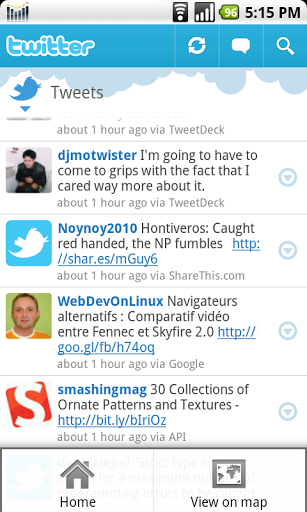
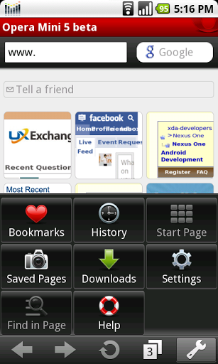
 Android is great, but like any other platform, there's room for improvement. As I wrote before, Android has conventions that are bad for UX. I was actually afraid that these conventions could not be broken, because those hardware buttons are here to stay and forcing changes could bring injustice to Android hardware buttons.
Twitter and Opera Mini 5 are two new Android apps that stand out because of their great UX design. I don't know if I should consider this fortunate or otherwise, but they're good because of not following Android conventions.
Twitter's deviations from Android app conventions include the title bar (thicker and has clickable elements), putting buttons on the screen that are usually found in the menu, and having different look and feel of tabs.
Opera Mini 5's share of deviations include the lack of menu, using the menu button to show/hide the Address Field / Search, and the inclusion of a mouse pointer among many others.

I consider all of the said deviations positive. Contrary to what I believed, the hardware buttons are still useful. They are also great especially because of showing more of the necessary GUI elements on the screen. It's time to graduate from hiding too many buttons in the menu. As I said, things that we see influence what we do. As long as clutter is avoided, it is good to show the user more of what's happening with an app and what he can do with it. After all, Google is open enough to allow deviations.
Twitter and Opera Mini 5 hold the key to the future of Android apps.

生存乃是不斷地在內心與靈魂交戰;寫作是坐著審判自己。......................................................................
ReplyDelete